
Spotify Wrapped

Strategic Refresh
Reimagining Spotify's biggest annual moment to fix declining engagement and "corporate cringe" fatigue.
The Problem
By the time Wrapped had become an annual tradition, it had also become predictable.
Four issues were dragging down what should have been Spotify's most anticipated campaign of the year:
Design fatigue
The format had grown repetitive, and competitors had started copying the format, eroding its "only Spotify does this" novelty.
Trust cracks
Bugs, including creator-crediting errors, were actively frustrating users.
Cultural shift
The aesthetic and tone were starting to read as "corporate cringe" rather than personal and fun.
Declining engagement
All of the previously mentioned were compounding into a measurable drop-off.
Putting the "U" in Music
The strategic response centered on one theme: "Putting the U in Music." Instead of just recapping data at users, Wrapped needed to reflect them — visually and interactively.
UX shift
Introduced a guessing/prediction mechanic, letting users try to call their own top artists and songs before revealing them.

Visual shift
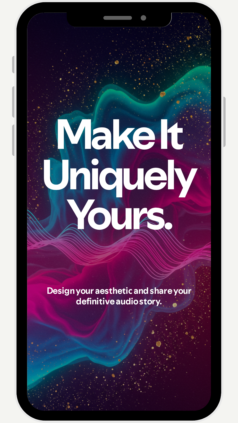
Color palettes and visuals now generate from the user's top genre, so every Wrapped looks different depending on who's viewing it.
Story shift
Positioned Wrapped as customizable and interactive, something that captures what a person's music feels like, not just a year-end stat sheet.

Success Metrics
01
Unique users clicking into their Wrapped
02
Unique users sharing their Wrapped externally
03
New Spotify sign-ups directly attributed to the Wrapped period
04
Sentiment in social comments/reactions (+/-)
